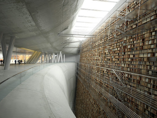
Over the past few weeks I’ve posted articles about a couple of interesting architectural designs, including some ‘humanoid’ electrical transmission pylons and a pavilion built out of shipping pallets. Now, via e-mail from reader Sven G., comes news of a novel design proposal for a library in Stockholm, Sweden. It was submitted via the CGSociety, which bills itself as:
. . . the most respected and accessible global organization for creative digital artists. The CGS supports artists at every level by offering a range of services to connect, inform, educate and promote, by celebrating achievement, excellence and innovation in all aspects of digital art.
The author, Olivier Charles, describes his work as follows:
This concept was made for an International Competition of Architecture, for the Stockholm Public Library. The project was conceived by Armel Neouze, Jacques Gelez and myself, and we entered the image into the competition after creating more than 1,000 renders. We started our project with some quick drawings and some deep discussion.
A project like this can quickly move and change without warning or restraint. Some ideas just didn’t have traction, whereas other brainwaves were instantly set upon.
When everyone agreed on the main visual, we created some 2D drawing and some fast 3D modeling to visualize and confirm the brainstorming.
(Click this and all images for a larger view)In this case, we started our discussion with the idea of a recessed library, backed by the hill, which rebounds on the idea of ‘the archivist’ of Schuiten.
Finally, we decided to create an infinite wall of books, with a concrete wave access, with this particular shape. The double hyperbola, looking like a widening rock face was originally thought up by Armel. We considered changing the image name to the ‘Mind Shaft!’
After validation of the concept, Armel and Jacques detailed the 2D drawing (first plans and sections). I could then detail the modeling.
. . .
The idea can move in parallel with the 3D model: shapes of the ground, bridges, stairs and walkways.
3D permits the artist to explore many ways, and can highlight some specifics that can’t be seen in 2D.
We started with the idea in sections, so we had to translate it into 3D and then attempt to reinforce the concept for a good impact.
There’s much more at the link, along with drawings and schematics of the work in progress. Very interesting stuff, for those who like unconventional architecture and want to delve into the creative process.
I’m not sure that the result would be very practical, from a librarian’s perspective, but it’s certainly visually impressive. (Oh – and forgive the pun in the title to this post . . . I just couldn’t resist it!)
Peter


I'd go if I was in the neighbourhood, surely.
Jim
For years I used the library in Bloomington, Indiana which had many of it's books stored in a mechanical book retrieval system. It was expensive to use so the librarians heavily discouraged patrons from getting books stored there instead of on the shelves. Any book which was misfiled was essentially lost as they didn't have the staff and budget to pull each storage unit to 'read the shelves'. They finally tore the multi-million dollar monstrosity out.