Via Coyote Blog, we learn of an article in the New York Times that takes a very interesting look, from a rather different perspective, at returns on investment in Wall Street over time.
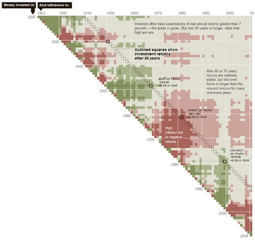
The article provides the graphic shown below. It’s far too large to reproduce here in full size, but if you click on it (or the link above), you’ll be taken to the relevant page of the New York Times, where you can see a larger version.
The article notes:
Ed Easterling … had a debate with a client about whether investors should expect to achieve long-term average returns in the future.
At the time, the average individual investor expected that the stock market would return about 10 percent a year over the next 10 to 20 years — or about 7 percent after inflation — according to surveys by the University of Michigan’s Survey Research Center, as well as UBS and Gallup.
But historical averages can vary widely depending on their starting and ending points. For example, averages that start before the 1929 crash are substantially different from those that start after it, and Mr. Easterling felt that choosing a single date was arbitrary. In response, he created the chart above, which shows annualized returns based on thousands of possible combinations of market entry and exit.
After accounting for dividends, inflation, taxes and fees, $10,000 invested at the end of 1961 would have shrunk to $6,600 by 1981. From the end of 1979 to 1999, $10,000 would have grown to $48,000.
There’s more at the link. Very interesting, thought-provoking and highly recommended reading.
To cut a long story short: if you’re banking on higher-than-average returns on the stock market to provide your retirement income . . . you’re probably screwed.
Peter
