We get conflicting messages about the reality of inflation from many sources. The government would like to persuade us that it’s very mild indeed: indeed, the ‘official’ measurement is currently “1.7 per cent before seasonal adjustment”. The Federal Reserve has set an ‘inflation target’ of not more than 2% per year (although that would still lead to a doubling of prices in less than 40 years). On the other hand, independent economist John Williams of Shadowstats.com points out:
In 30 years as a private, consulting economist, I have noted a growing gap between government reporting of inflation, as measured by the consumer price index (CPI), and the perceptions of inflation held by the general public. It has been my experience that the general public believes inflation is running well above official reporting, and that the public’s perceptions tend to mirror the inflation experience that once was reflected in the government’s CPI reporting.
The growing difference in perception versus reality primarily is due to changes made over decades as to how the CPI is calculated and defined by the government. Specifically, changes made to the definition of CPI methodologies in recent decades have reflected theoretical constructs offered by academia that have little relevance to the real-world use of the CPI by the general public.
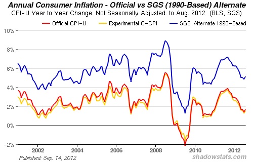
There’s more at the link. Mr. Williams offers an alternative calculation of inflation, using more comprehensive sources of data. He estimates the true current US rate of inflation to be nearer 5%, as shown below, courtesy of Shadowstats.com.
I thought it might be interesting to take a look at actual cost increases of various commodities over the past decade, and started looking for information. It’s sometimes surprisingly hard to get true numbers out of government sources – at least, in a form that’s readily understandable. I had to turn to other commentators to find graphic portrayals of what’s been happening – and even they sometimes differ from one another, due to the difficulty in getting accurate information. Keep this in mind when reading further. Bear in mind, too, that the numbers below are those ‘officially’ calculated by US government sources, or by others using data provided by those sources. They’re not those provided by independent economists and experts (who, like Mr. Williams, would probably use rather higher figures).
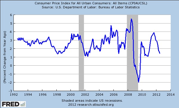
That said, from an NPR report, here’s how the US Federal Reserve sees the percentage change in the ‘official’ rate of inflation over the past couple of decades.
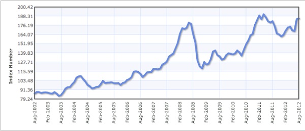
Next, from The Political Commentator, here’s a graph of the commodity food price index over the past decade.
Note that it shows a doubling of the commodity food price index over ten years. That hardly squares with the ‘official’ rate of inflation . . . but then, the US government leaves food prices out of its ‘core’ Consumer Price Index (i.e. inflation) calculation.
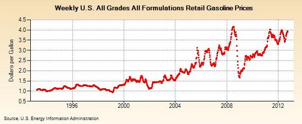
From the US Energy Information Administration, here’s a look at gasoline prices over the past two decades.
Again, you’ll note that the fuel price is almost three times higher today than it was a decade ago. Hard to square with the official inflation rate – but again, fuel prices are excluded from the calculation of the ‘core’ CPI. (For an interesting perspective on inflation, compare the fuel and food price graphs. Notice how their plots are very close to each other? That’s because fuel cost is a fairly large component in growing, harvesting, preparing and distributing foodstuffs. If fuel costs rise or fall, food costs tend to follow – at least to some extent.)
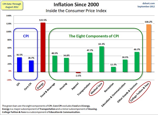
Finally, courtesy of Advisor Perspectives, here’s an illustration of the different elements that go into the Consumer Price Index, and how prices for each element have increased (in percentage terms) from 2000-2012. Note how the ‘Core CPI’ figure differs from those of the other elements.
I highly recommend reading the four resources linked above, from which/whom these illustrations have been drawn, and (of course) John Williams’ Shadowstats.com as well. They’re all very informative.
A factor that’s not apparent in the above calculations and depictions is that inflation in food prices is often not compared volume-to-volume. For example, researchers might include the cost of a box of spaghetti, or a can of beans, in their routine investigation of prices. However, those items may have become smaller, while their manufacturer continues to charge the same price per container (irrespective of its reduced contents). This is very common in food packaging, as manufacturers count on consumers not noticing the change and therefore not complaining about the increased cost per unit volume. Thus, an inflation calculation based on the cost of a container of a given foodstuff might not notice, or allow for, the reduction in the weight or volume of food sold in that container.
If Mr. Williams’ calculations about inflation are correct, and the true CPI is about three times higher than that postulated by the government, then one could also presume that the components of that CPI are also about three times higher than officially calculated. Even if one doesn’t do so, the increased prices of commodities that you and I buy every day – food and fuel – are alarming . . . yet the government excludes them from the ‘core CPI’ rate, which is what it uses to calculate annual increases in Social Security and pensions. This saves the government a great deal of money – the increases it has to give are a lot lower – but it doesn’t prevent us having to pay those increased prices regardless. This is compounded when the ‘official’ rate of inflation is much lower than the actual one, as Mr. Williams very cogently points out.
I hope this has helped some readers get a better idea of why prices are so much higher today than we’re used to, and why that reality is not reflected in official US government inflation calculations. It’s a cold, callous, deliberate political con game, designed to blind us to the reality of the situation. As all the ‘funny money’ currently being printed by the Federal Reserve makes itself felt (as discussed in the latest ‘Around The Blogs’ segment this morning), that reality is going to get even worse.
You might want to ask your Congressional representative and/or Senators why the US government is allowed to get away with lying to you about the rate of inflation (or, rather, in the way it calculates it). If they hesitate, prevaricate, or obfuscate, remember in November and vote them out of office!
Peter
Every day, it looks more and more like government is a scam. Appears the whole economy is a Ponzi scheme, not just Social Security.
Goatroper